The NHS design system was set up to meet the needs of teams building public services. We are often asked whether there should be a separate NHS design system for digital services used by staff. It’s an understandable question. Staff services can have different needs and might be a lot more complex.

However, a lot of components and patterns are useful for both types of services. So, we think that maintaining 2 distinct systems would be a mistake, and instead we’re extending the existing NHS design system with new components and patterns focused on staff-facing services.
One reason for this decision is that, just like digital services for the public, staff services are not all alike. Some might be used by a wide variety of staff, for example, a service for booking annual leave or accessing training materials, while others might be used only by highly specialist staff such as mammographers or midwives. Similarly, some services may be used all day every day as part of a staff member’s core work, whereas others may be used only occasionally.
This all means that there’s no one-size-fits-all pattern for staff services. Some of them may benefit from using the same patterns as public services, like question pages and task lists. Others may need more complex or specialised components, such as for image annotation or data visualisation.
Digital services for staff and the public sit on a spectrum, not a split.
Another reason for this decision is to promote consistency between services. Staff often use multiple NHS services, so making sure different systems across the spectrum work in predictable and consistent ways makes them quicker to learn and easier to use.
And finally, this approach reduces duplication and additional maintenance, allowing us to move faster and save money.
Here are some of the additions and changes we’ve made recently to support staff-facing services.
Account header
Most digital services for staff require them to log in. To support this, we’ve updated the header component with a new account section where you can add a 'log out' button at the top-right of the page, as well as any other account-related links.

This section is flexible, to meet the needs of your service. For services often used on shared devices, for example, you might need to show the name of the user currently logged in, to help discourage account sharing. If your users work across organisations or sites, you can display this too.
Smaller checkboxes, radios and buttons
Some digital services for staff help them manage a lot of information, whether that’s lists of patients or clinical data. These services may need to have a higher density of information on the screen and perhaps have options for filtering and sorting.
To support this, we’ve added variants of the checkboxes, radios and buttons components which are smaller than the usual ones, whilst remaining within accessibility guidelines for target area size.
These should not be used by default, as the larger versions are still more usable and accessible. However, in some contexts they can be useful.
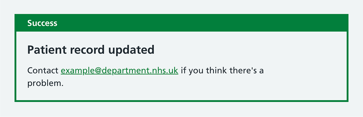
Notification banners
More complex digital services are more like a 2-way conversation than a linear one-way journey. To enable the service to communicate back to the user, we have added notification banners, which can be used for service-wide announcements and for success messages.
Pagination
For those digital services helping staff manage a lot of information, there’s often too much to list on one screen. In these scenarios, pagination is essential.
The new numbered pagination component lets them find what they’re looking for. This should be used with a sensible sort order and can be combined with a search or filter pattern.

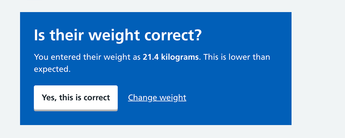
Interruption pages
Whilst we usually design services to help users complete their task as quickly and efficient as possible, occasionally it can be necessary to slow them down and introduce some friction.
The new interruption page uses a blue background with white text to visually signal that something needs attention. This should be used sparingly, to avoid users becoming blind to it.
The pattern can support clinical safety, by helping to alert staff when they are doing something unusual that may be a mistake.
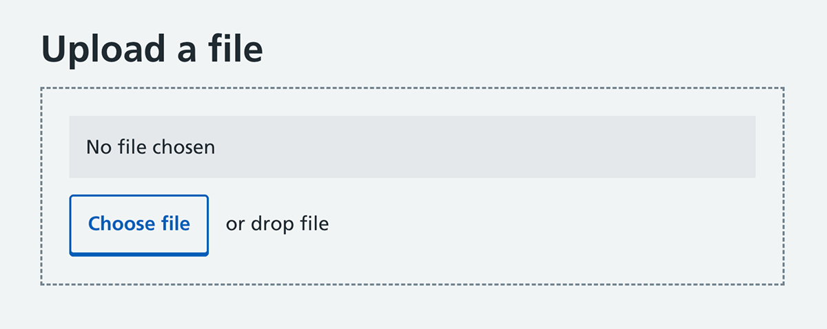
File upload
Finally, for services where staff are manipulating files or data (and yes, that means spreadsheets too), there is a new file upload component.
Plenty more to come
We don’t pretend that the NHS design system will have everything that your staff-facing digital service needs. You may find that you still need to modify some components, or design and develop new ones. This is all allowed. The design system is a foundation, not a boundary, and you should do research and meet your users’ needs.
However, staff services should always start with the NHS design system, and extend where needed, rather than building a different foundation from scratch.
We’ll be adding more components and patterns with staff services in mind over the coming months and years. Currently under development are a sortable table, secondary navigation, 'select all' checkboxes, error page patterns and an autocomplete.
The NHS design system is developed with the support of the wider community designing and developing NHS digital services. So, if you’re working on a staff service and have research, patterns or components to share or discuss, get in touch.
Authors


Last edited: 15 April 2026 5:05 pm